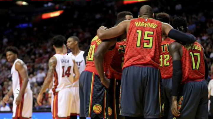
Taking a look at the Atlanta Hawks’ 2015-2016 mismatched jerseys.
Ugh. As both a fan of the Atlanta Hawks and a basketball jersey aficionado, I’ve been dreading writing this piece. But with the Coronavirus sidelining play for at least 30 days, I guess there’s no better time.
In the summer of 2015, the Hawks were coming of their 60-win, franchise best season that saw them in the Eastern Conference Finals. Outside the loss of DeMarre Carroll, the team was looking to run it back with all their best players returning. Even with a very similar roster, Atlanta looked very different the next season.
The Hawks revealed new colors, jerseys and logos, moving away from the fairly plain-looking kits they had rocked since 2007. The new look featured a red, charcoal and ‘volt green’ scheme, while bringing back the “Pac-Man” logo from the ’70s, ’80s and ’90s.
The jerseys are still being used today, and while they’ve never been a huge hit, are still among the league’s most unique looks. In fact, they used to be even more unique.
One of the main ideas behind the kits was the ability for the team to mix-and-match their jersey tops with their shorts. Meaning if they were wearing the red ‘alternate’ jersey, they could be wearing the charcoal ‘road shorts,’ and vice versa.

I remember not being a big fan back then, and looking back now I honestly have no idea what they were thinking. Obviously the Hawks were trying to stand out and perhaps get more mainstream attention after their best season ever, but this was such a swing and miss.
Maybe the mismatching of it all wouldn’t have been so bad if the base jerseys themselves weren’t bad jerseys to begin with, but overall I just don’t think mismatching belongs on NBA courts.
The Hawks’ use of the mismatch was panned by fellow jersey critics, and luckily they retired it after just one season. Since then, they’ve appeared on a few ‘worst jerseys ever’ lists, and are widely recognized as the worst threads an Atlanta Hawks team have ever worn.
A complete redesign of the Hawks’ jerseys have been teased at for a while, and it seems like they may be coming in time for next season. Hopefully they learn their lesson and keep it the same color, top and bottom.
