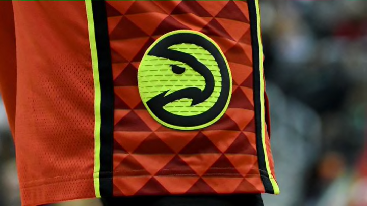
Bidding farewell to the Atlanta Hawks triangle-pattern jerseys.
The Atlanta Hawks won 60 games in the 2014-2015 season, clinching the first-seed in an Eastern Conference that also featured an in-his-prime LeBron James. The team was ready to move from a fringe playoff contender to NBA powerhouse, completing their rebrand with, well, a rebrand.
In June 2015, just weeks after their loss in the Eastern Conference Finals, the Hawks unveiled their new look. They started with a run-of-the-mill blue, red, and silver look that fit their brand of basketball at that time: boring, yet effective. They ended with an odd mix of neon and triangles that quickly split the opinions of fans.
The new look!#TrueToAtlanta pic.twitter.com/wz8JQzHmoH
— Atlanta Hawks (@ATLHawks) June 24, 2015
The triangles (which were hilariously supposed to represent Hawks’ feathers) and “volt green” weren’t the only wrinkles the redesign brought to the table, the jerseys were also made to be interchangeable between the tops and bottoms.
The idea was that the team could wear red jerseys with black shorts one night and black jerseys with red shorts the next. It was bad. While the Hawks were certainly trying to steal some mainstream attention with their new look, the idea just felt too big and guilty of being different just for the sake of being different.
In the years since, the Hawks have made minor adjustments to improve this look (including ditching the mismatching of jerseys after just one season), and have stuck with it despite running rumors that another rebrand was just around the corner.
Yesterday, the triangle-patterned look was laid to rest, with a new jersey leaking on Twitter Friday morning.
It was just tipped to me the Atlanta Hawks will be debuting the following jerseys starting next season, throwback colors/trim with the theme celebrating “The Human Highlight” era. pic.twitter.com/Dkk8tit7Zv
— Rob Perez (@WorldWideWob) July 17, 2020
A few hours later, a piece written by Sarah K. Spencer of the AJC reported that “As a whole, the team’s new uniforms also will depart from the volt green color and the triangle background,” and that the team will be moving to a retro color scheme featuring the yellow, black and red seen above.
I’m still not sure how I feel about the new look (which is reportedly the team’s new “Statement” or alternate jersey), but I do know I’m happy to see the triangles being retired.
There’s a reason we never saw the look being replicated in the slightest by any other NBA team: it just didn’t work. With almost every rebranding, teams are looking to be the first to a new trend which usually less to an influx of copy cats when it hits. Rember the silky jerseys of the late-2000’s or the big, cartoon-like logos of the ’90s?
The Hawks’ look felt like a prediction of the modern NBA, a futuristic, over-the-top innovation that didn’t work in 2015 and still doesn’t in 2020 while also failing to actually predict the future.
The actual trend that we see NBA teams following is going back to their old jerseys but with an updated, modern-day flair. The Cavaliers, Raptors, Warriors, Suns, Nuggets, and quite a bit more teams have all returned to old looks in more than just throwback jerseys other the last few seasons, and if the AJC’s report is true, the Hawks will be joining that list.
The red, yellow, and black scheme was used by the team in the late-90’s and early aughts:

The Hawks are now late to the current jersey trend, but you have to at least give the old jerseys some credit. Whoever designed those kits obviously tried, and thinking outside the box is always appreciated, even if it doesn’t work out.
The triangle era in Atlanta is over, and we look forward to the full reveal of the new jerseys, which may be accelerated thanks to the leaks.
If the current trend of repurposing old jerseys into new school looks hold, maybe we’ll see the Atlanta Hawks of 2040 bringing the triangles back. As long as they don’t mismatch, we’ll be ok.
What did you think of the Atlanta Hawks’ old jerseys?
