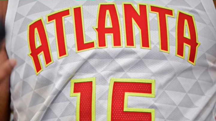
Grading each of the Atlanta Hawks’ new jerseys.
As someone who 1. loves the Atlanta Hawks 2. hated the team’s old triangle-patterned jerseys and 3. created an NBA jersey blog for his college senior project, today was a big day for me.
The Atlanta Hawks officially unveiled their new jerseys Tuesday morning after their black alternate jersey leaked over the weekend. The new-look features a return to the red, yellow, and white scheme of the 70s and 80s while introducing “Infinity Black” and “Granite Gray” to the mix.
Let’s take a deeper look at each of the three jerseys revealed and assign a grade to each:
https://twitter.com/ATLHawks/status/1285591190268780545
The Icon Edition (Red): B
Maybe my least favorite of the bunch, the icon still shines. These distinctly feel like the jerseys they wore in the late 1970s, which the team wore as retros a few seasons back.
I like the more rich shade of red used much more than the one used on their “ATL” alternates during the triangle-era, and fullying spelling out Atlanta is also a big plus. I have two problems with this jersey: the shorts are a tad busy, and I can’t shake the resemble the fast-food chain McDonald’s.
All three jerseys have the same pattern on the shorts, so I can’t knock this specific edition for that, but it’ll take me some time to stop calling these the McAtlatnta’s.
Overall, I like the red, but it doesn’t hold a candle to the next two.
The Association (White): A
Clean, simple, effective. These three words can be used to describe some of the best uniforms in NBA history, and they can certainly describe this look. I like torch red as a secondary color rather than a primary, and the numbers and wordmarks really pop.
Take a closer look at our new threads 👀
— Atlanta Hawks (@ATLHawks) July 21, 2020
⚪️⚪️ Association Jerseys ⚪️⚪️ pic.twitter.com/zTIJhipilY
There’s not much else to say, as there’s not much going on. Just days removed from the triangle-era when there was way too much going on, having too little is a perfect problem to have. This will be the first edition I buy when they go on sale.
The Statement (Black): A –
These have grown on me since the initial leaking, but they still feature one big flaw: the Jumpman. Apparently the whole league will be switching to the Jordan logo on their Statement Editions (which are essentially alternate jerseys), which doesn’t make much sense to me.
Regardless, the jersey itself is nice, and the lone jersey to spell out ‘HAWKS’ across the chest, which I see as a plus. The deep black that replaces their old charcoal look is great, allowing the red and yellow to catch eyes and turn heads.
The shorts, which I see as the only main negative from the whole set, work best in this colorway, topped off with a yellow “Pac-Man” Hawks logo which has never looked more like the video game character.
What do you think of the new Atlanta Hawks uniforms?
