The Worst Jerseys in Atlanta Hawks History
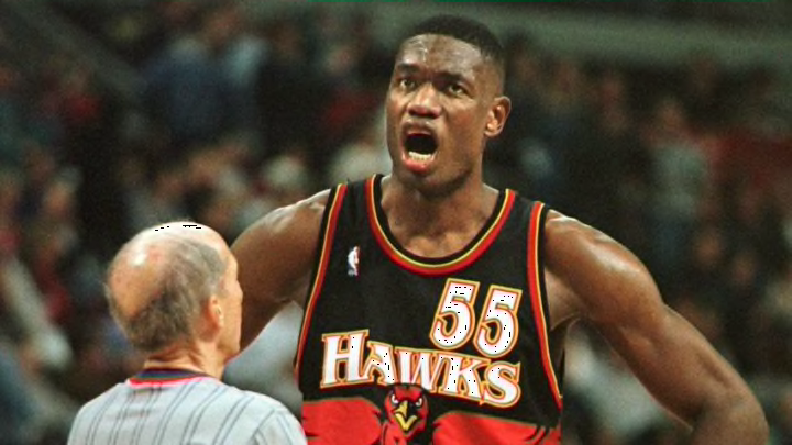
# 3: 1995-1999 Road

This is going to be my most controversial placement on this list, as I know some people love these jerseys. Some were even calling for the Hawks to return to this design for the new jerseys. Alas, I’ve never liked these, and never will. The oversized, cartoon-like logo on the chest was a trend (product?) of the late-1990s and worked well for some teams like the Raptors and Bucks, but doesn’t mesh with the Hawks brash color scheme.
Also, the 2015 Hawks were roasted for wearing mismatched tops and bottoms, but these jerseys were doing it way before then, and no one seems to care. The white versions are better, but not by much.
#2: 2015-2020 Alternates

Of the three variants of the triangle-patterned jerseys (red, charcoal, white), these red “ATL” alternates were my least favorite. Perhaps it was because the neon popped more than usual (a bad thing) or because the Hawks decided these were the ones they were going to wear most often.
The triangles themselves are also more visible in this form than black or white, which is not a positive. I wrote more on the rise and fall of these jerseys a few days back, and you can check that out here.
#1: 2004-2007 Alternates

The Atlanta Hawks’ new jerseys are returning to yellow for the first time since they retired these jerseys in 2007, and thankfully it’s just as a secondary color. These all-yellow threads are just flat-out gross. To make matters worse, the Hawks wore these in the ’04-’05 season, when they won a franchise-low 13 games.
I’d take “Volt green” over these mustard eye-sores any day of the week.
