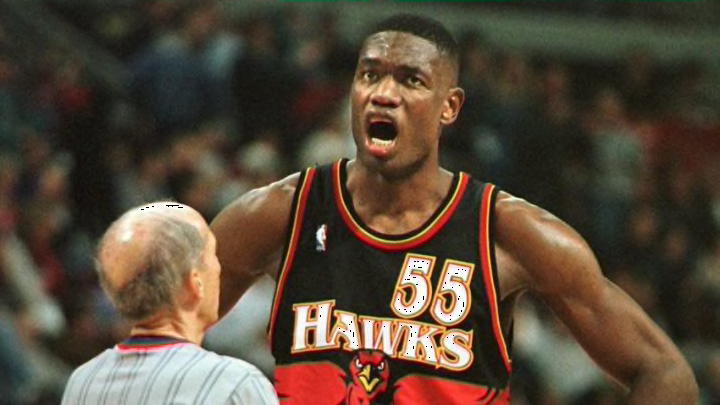
Picking the three worst and five best jerseys in Atlanta Hawks history.
The Atlanta Hawks made news earlier this week when they unveiled their new jerseys which will make their debut next season. Reviews for the new look were very positive, with some admirers wondering were they ranked among the franchise’s best.
The new threads borrowed colors from jerseys of old but did enough differently to avoid being true throwbacks. The move retires the neon and triangle-riddled look of old, which were pretty widely considered one of the worst base unis in the league.
Hawks fans are not unaccustomed to rebrands, as the team is not shy about switching their look up. Since 1992 the team has had seven unique rebrands (including the newest one, per Sportslogos.net).
That, combined with a deep history that dates back to the early 1950s, the Hawks have a great number of uniforms to look at. Here, we’ll attempt to look back on all of those home, road, alternate, and city jerseys to find the best and worst kits of Atlanta Hawks history.
Luckily, the Hawks have had more hits than misses, and since we’re only including one jersey from a given design (only one triangle jersey), we shortened the lists into a top-five and a bottom three.
Finally, a quick note on the new jerseys. Since we haven’t seen them in-game just yet, I’ve left them off for now. Without further ado, let’s get started.
